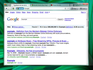
These are NOT FINAL! THEY ARE ONLY FOR BRAINSTORMING/EXPLORATION!
Initial Theme Mockups for Firefox 4.0
Version A – Tabs-on-Bottom
 Possibly add a Bookmarks widget as an upfront replacement for the Bookmarks menu/Bookmarks toolbar (option to turn those on would remain).
Version B – Tabs-on-Top
Positives
- Save Vertical Space
- Efficiency/Remove Visual Complexity – Right now the tabs have to be connected to something. So we are adding an extra visual element for them to connect to.
- Shorter Mouse Distance to Page Controls
Negatives
- Breaks Consistency/Familiarity – Moving things confuses existing users.
- Title is MIA – With the space removed from the titlebar you only get the truncated version in the tab.
- Longer Mouse Distance to Tabs – Takes longer to mouse to a tab.
- Lost Space – Sandwiched in between the application icon and the window widgets you lose some space.
Combo Stop/Refresh/Go Button.

Attached at the end of the location bar.
- Turns green when you start typing.
- Blends with the location bar when at rest.
- Turns blue on hover.
- Turns red when a page is loading.
The proposed iconography is mostly colorless. Adding color to these temporary action driven buttons will make it more obvious something is going on.
